About the Project
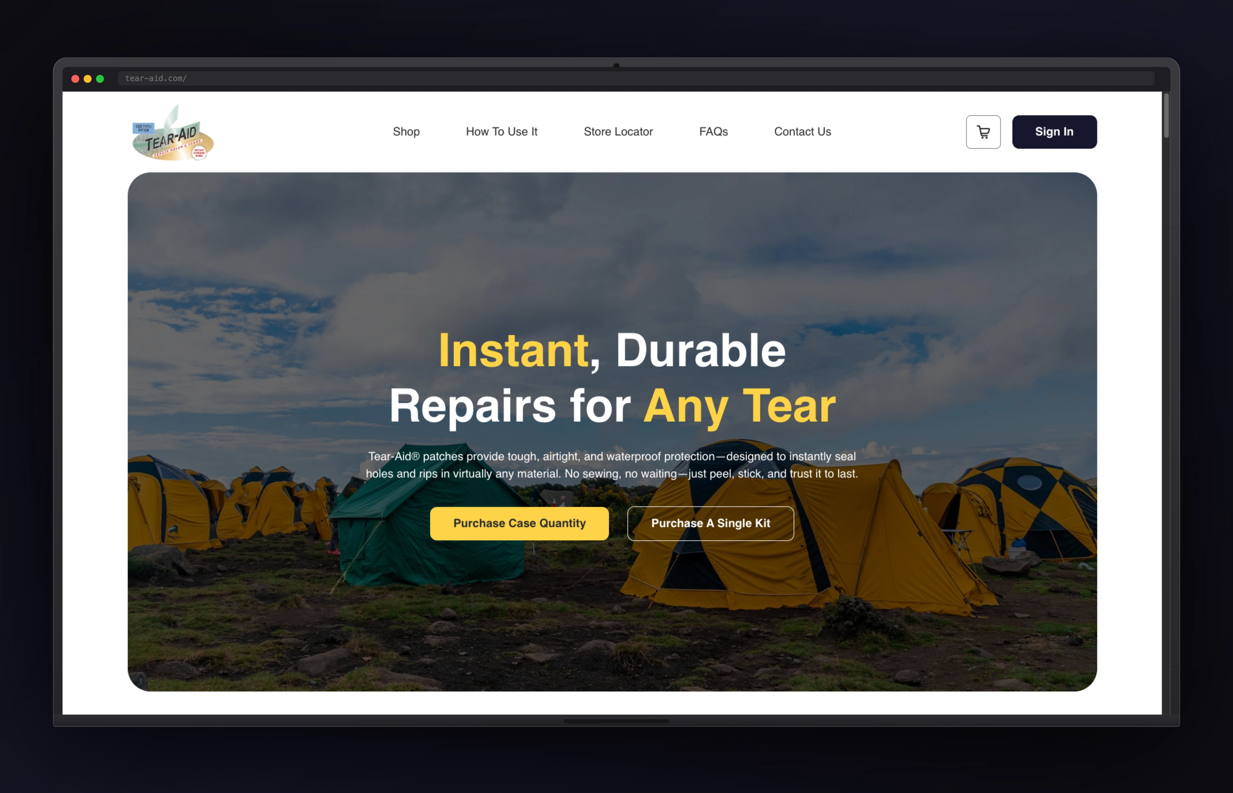
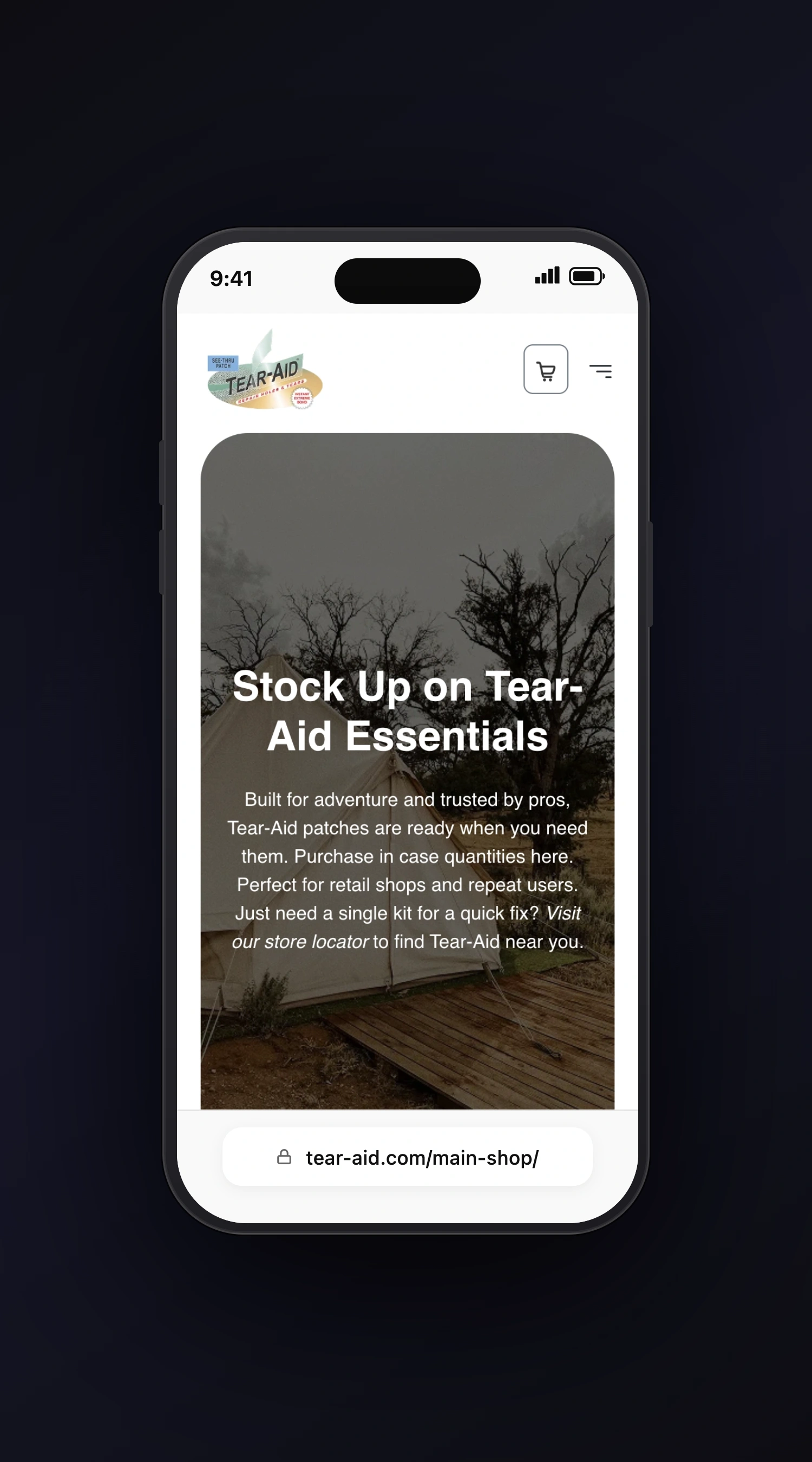
Tear-Aid needed an ecommerce website that could present the product more clearly and support stronger buyer confidence. Product websites in this category need to explain use cases quickly, reduce hesitation, and make it easy for visitors to move from understanding to purchase. This project focused on translating the Figma direction into a WordPress WooCommerce build that feels polished, practical, and easier to shop. The experience needed to support both brand presentation and transaction flow. That balance was central to the implementation.
Tear-Aid
Ecommerce / Consumer Product
Concept Of the Website
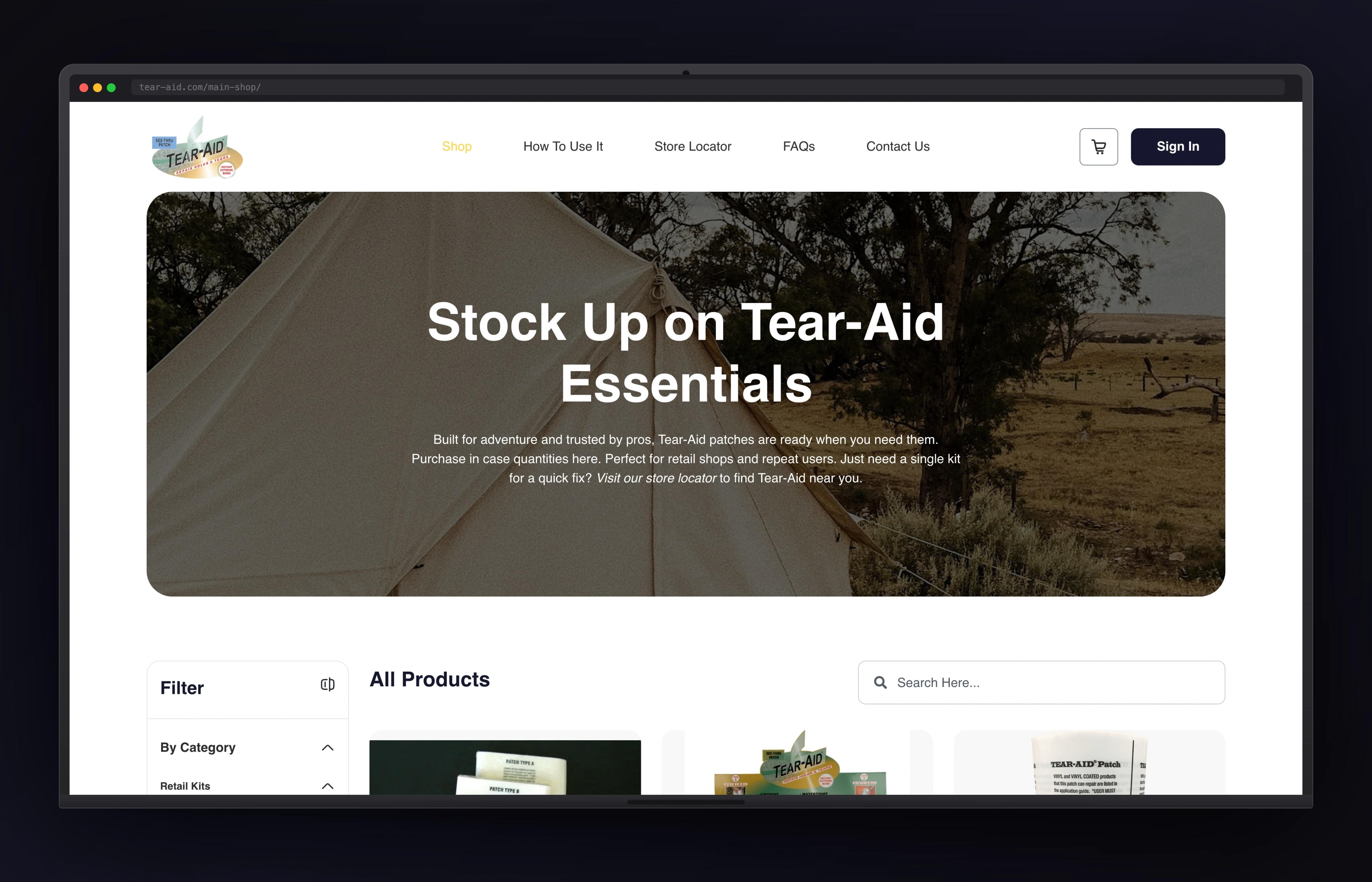
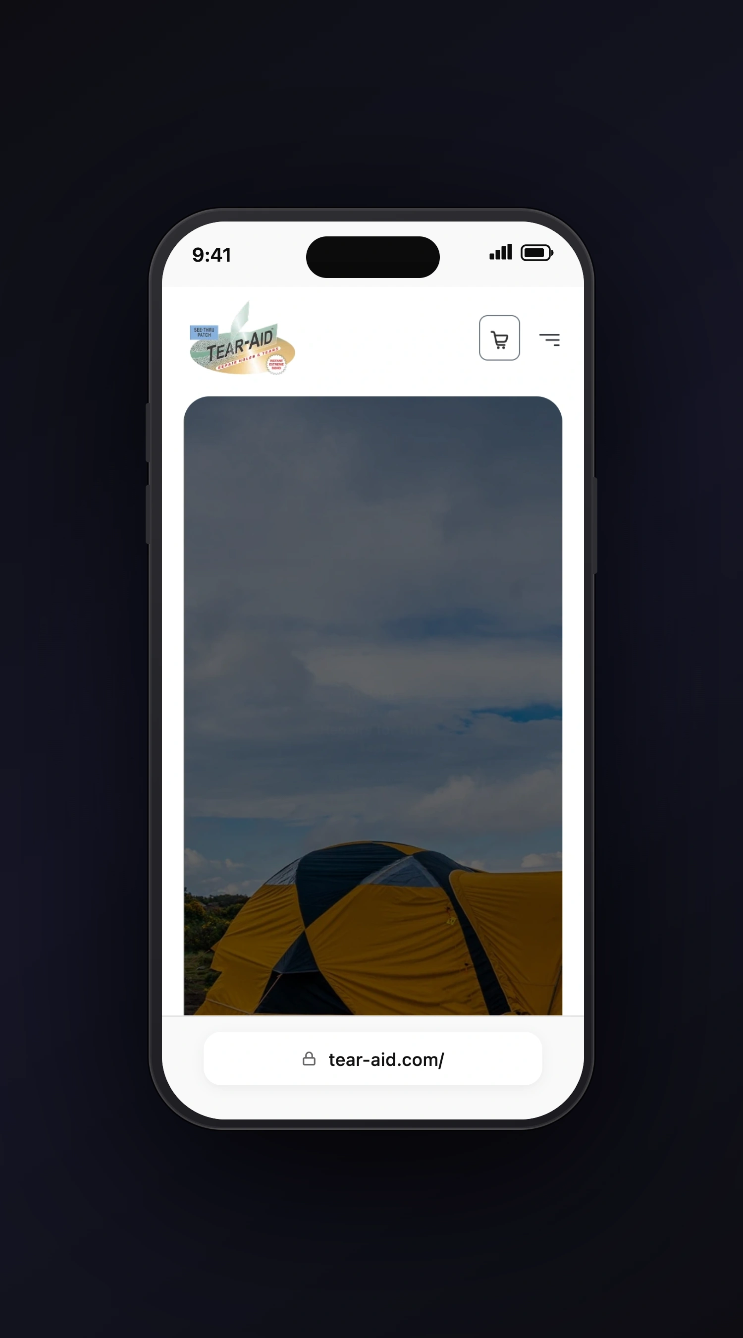
I mapped the Figma layouts into a WordPress WooCommerce build with cleaner product presentation, stronger CTA placement, and more organized supporting detail. The page flow was shaped to reduce decision friction and make important information easier to find. I also paid close attention to mobile shopping behavior so the experience would remain smooth across devices. This helped the site feel more conversion-ready while preserving the design intent.
Initial Structure
The challenge was combining a design-led experience with a storefront that still felt easy to use. Product information needed stronger structure, trust cues needed more visibility, and the route to purchase needed to feel cleaner. The WooCommerce experience also had to stay responsive and manageable for the client after handoff. Ecommerce only works well when explanation and action support each other clearly.
Brand Voice
Tear-Aid needed a voice that feels practical, credible, and aligned with product trust, storefront clarity, and purchase flow. The copy keeps the experience focused on what visitors need to understand, trust, and do next.
Brand Characteristics
- A modern Figma to WordPress WooCommerce shaped around product trust, storefront clarity, and purchase flow.
- Clear hierarchy for Ecommerce / Consumer Product visitors who need to understand the offer quickly.
- Flexible content sections built around Figma to WordPress build and WooCommerce setup.
- Responsive presentation across the desktop and mobile project screens.
- A practical toolset centered on WordPress and WooCommerce to keep the experience maintainable.
- A polished visual system that supports Tear-Aid's credibility without overcomplicating the journey.
Outcome & Results
The finished website gives Tear-Aid a stronger ecommerce presence and a more effective route to purchase. Visitors can understand the product faster, trust the offer more easily, and move toward checkout with less friction. The site now supports both product storytelling and storefront performance much better than before.